If you squint at most websites, you’ll start to see the same repeated patterns. For example, a common product or service homepage might have the following structure:

Navigation is usually logo to the left and navigation items to the right. Heroes are a big, impactful statement to the left of something visual or centered and surrounded by oodles of weird shapes. The tops and bottoms of websites don’t change often, but every page probably has a unique middle. How you enable editors to work in that middle can make or break your Wagtail CMS.
A simple block pattern for Wagtail sites
Most websites consist of huge, stacked “blocks” of content (let’s call them “Container Blocks”), in what is known as composable design. Stacking blocks can be useful if you want flexibility in your page designs. In composable design, you should create well-defined, structured blocks like ProductOfferingBlock and PricingCardBlock, but sometimes you just need to stick some content into a grid and make it presentable. Our simple block pattern provides a method to do just this.
In HTML and Tailwind CSS, a simple two-column content block might look like this:
<div markdown="1" class=”py-10 lg:py-16 bg-gray-100”>
 <div markdown="1" class=”container”>
   <div markdown="1" class="grid gap-8 lg:grid-cols-2 lg:gap-16">
     <section>
       <h2 class="text-2xl lg:text-4xl font-bold">Zero app configuration (almost)</h2>
       <p>Ditch the Dockerfiles and confusing Kubernetes manifests. You can get started by defining the command to run your webserver and AppPack will do the rest.</p>
       <a href="/docs/configuration" class="button">Learn more</a>
     </section>
     <div markdown="1">
       <figure>
         <img src="/dist/img/zero-config.png"
           alt="AppPack's minimal configuration for Python, Node, and Ruby."
           height="312"
           width="363">
       </figure>
     </div>
   </div>
 </div>
</div>
(In fact, a block just like this is found on AppPack.io, our solution to no-stress AWS deployment)
You may find it easy to imagine this HTML repeated on the page with slight variations. With this simple structure, we have some essentials:
- Content can be grouped visually via the padding provided via
py-10 lg:py-16and the background effect (in this case,bg-gray-100). - Additionally, since content separation happens on the outermost
<div markdown="1">, this is a great place to define a block-level theme, e.g..theme-high-contrast. - Visual relationships between content can be established via the grid. Grid ratios can be adjusted to emphasize some content of others. Pre-defined grid options can be defined, e.g. 2 equal columns, 1 / 2 columns, 3 equal columns, etc. More complex grids are also possible.
- Some design constraints are defined: vertical rhythm (spacing) is consistent (
py-10) and we know all grids havegap-8on small displays,gap-16on large displays. These constraints could also be configurable, with few options for variation. - We have clear columns to fill with content, and most designs rarely care about the height or length of columns. If something is off, it will look off.
In Wagtail CMS, you can define StreamFields to allow mixed content, from paragraphs via blocks.RichTextBlock to full fledge StructBlocks (combinations of child blocks). This fits our pattern perfectly. Porting this to Wagtail CMS, you may expect the following:
class ContainerBlock(blocks.StructBlock):
   theme = blocks.ChoiceBlock(
       choices=THEME_CHOICES,
       required=True,
       label="Theme",
       default="white"
   )
   columns = blocks.StreamBlock(
       [
         ("column", Column())
       ],
       label="Columns",
       min_num=1,
       max_num=4,
       required=True,
       help_text="Max 4. Single columns are centered. Columns stack on small displays.",
   )
...
In this basic example, ContainerBlock only accepts a set of colors (possibly for the background), and a single StreamBlock, Column, which looks something like this:
class Column(blocks.StructBlock):
   content = blocks.StreamBlock(
       [
           (
               "paragraph",
               blocks.RichTextBlock(
                   features=DEFAULT_LONG_FORM_RICH_TEXT_FEATURES,
               ),
           ),
           ("image", ImageChooserBlock()),
           ("form", FormBlock()),
           ("quote", QuoteBlock()),
           ("accordion", AccordionBlock()),
           ("embed", EmbedContent()),
           ("raw", blocks.RawHTMLBlock()),
           ("button", ButtonBlock()),
           ("card", CardBlock()),
...
The list of types that could be added to a Column varies by website, but in general, they are elements and components: buttons, headings, text, embedded forms, cards, etc. If you are familiar with Atomic Design Methodolgy, Column probably contains Atoms and Molecules, with each ContentBlock being an Organism.
Building with ContainerBlocks
Our simple ContainerBlock will look like this when added to a StreamField:
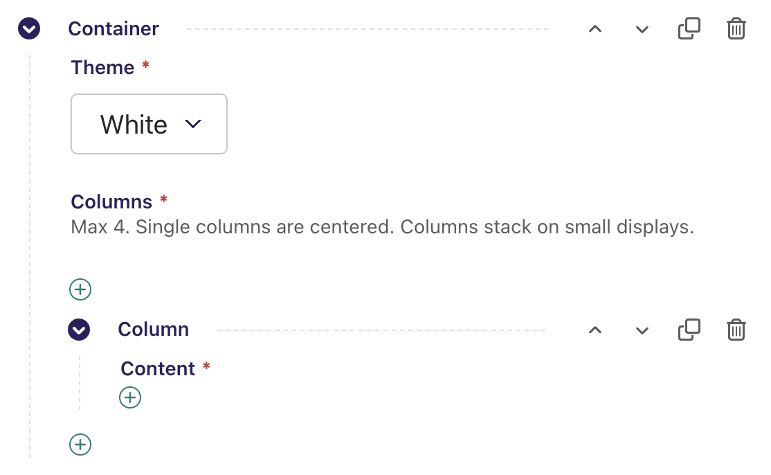
Editors should immediately recognize that they need to begin adding columns or content. This method is preferred for simpler grids over more explicit variations (e.g., 2ColContainerBlock, 3ColContainerBlock), as you gain the ability to reorder and resize content without the need to delete and recreate it in Wagtail CMS. It also allows editors to start thinking about the grid or the content first, whichever works best for their workflow.
Our example is limited to a maximum of four columns, which we have found to be flexible enough for most content and friendly to small (1 column), medium (2 columns), and large (4 columns) responsive displays. Consider this more advanced grid if you want a general, flexible starting point:
<div markdown="1" class="grid gap-8 justify-center mx-auto lg:gap-16 grid-cols-[repeat(auto-fit,minmax(200px,1fr))]">
 <!-- columns here -->
</div>
Our example is intentionally simple. Here are a few things to consider when adopting this pattern:
- ContainerBlocks could be customized in many ways: vertical padding, coloring, grid variations. Group these options, give them safe defaults, and collapse them so the editor immediately sees the ability to begin adding content. Editors will often think content first, followed by styling second.
- If you are repeating a specific
ContainerBlock+Columnstructure, such as Text + Image, consider refactoring that into a simpler StructBlock that lives as a sibling toContainerBlock. TheContainerBlockpattern is meant for flexibility, and has little semantic meaning. - Additionally, avoid making a
Columna junk drawer for every component in your design system. For example, a photo carousel may fit in a single or two-columnContainerBlock, but it has unique semantic meaning and specific display requirements. Just because it can fit does not mean it should. - Navigating the UI for deeply nested blocks can be challenging. It is easy to get lost on long pages*. Aim for shallow nesting for usability. Blocks added to
Columnshould only allow ~one more level, e.g.Column>CheckList>ListItem.
* All the more reason to carefully plan your Page types.
A well-tested pattern
The ContainerBlock pattern is one we have been using since 2014, and the idea of “blocks of content” is inherent in many modern content management systems. As a tried and tested pattern, we reach for it first and refactor from it based on editor usage. When starting a new Wagtail CMS project, it allows us to quickly demo content while we flesh out Page types and other more structured StructBlock types (e.g., TextImageBlock, CardGridBlock, etc). Column forces us to think about the smallest parts of a webpage, and how they will be represented to editors.
Lastly, it serves as an excellent fallback. While there may be more exact layout options, editors know they can always get something presentable with this pattern. After all, it’s all over the web.
(Featured photo by Magda Ehlers: https://www.pexels.com/photo/orange-cube-1340185/)