
It’s 4:59pm. Test prints litter the floor and a rogue Pantone chip flutters from your sleeve. Jim from marketing likes 808C, but Sara’s favorite color is ‘rorange.’ Chroma combat ensues and eventually a Final Four™ emerges. You rush to the nearest computer and save them into perpetuity: brand-guide-new-final-final-V5.pdf.
Weeks pass and you begin to relax. HR asks for a brochure and it’s met with raucous applause. Business cards? Easy. Social media graphics? Chef’s kiss. Event posters? Done and dusted. Boss Man asks for a bar graph and… crickets.
Your vision blurs and pixels begin to fall away beneath your feet. Your brand’s color palette, so carefully crafted and once revered, has a fatal design flaw: with only four colors to pull from, the graph is overly simplified and unclear, leaving the data’s story left untold. Just as you begin to push back dinner plans, a Looper steps forward from the shadows—a figure worn by time, their eyes carrying the weight of lessons hard-earned. With a slow, deliberate motion, they extend a weathered hand, a tattered paper gripped between their fingers. You take it and read:
Adapting Brand Colors for Charts and Graphs
In this guide, we’ll explain how to take a limited brand color palette and expand it to create accessible, easy-to-understand data visualizations that highlight meaningful insights.
Step #1
Gather your brand colors
Take your brand colors and remove any grays, browns, and pastels.
In this example, the brand has two blues and a light gray as primary colors, and a yellow, brown, and green as secondary colors.

We will be working with the bright blue, yellow, and green.

Step #2
Select a shade of nearly white and nearly black
We’ll use these to build our color scales. If these shades already exist in your brand, start with those.
In this example, we're using the brand’s light gray and the brand’s dark blue. Building off of existing brand colors for this step will make our palette feel more cohesive.

Step #3
Create 11 step scales for each brand color
Use Illustrator’s blend tool* to create a 9 step blend from your nearly white color to a brand color.
Now do the same thing, but go from the brand color to your nearly black color.
Place the two scales next to one another and decrease the number of steps until you have a single 11 step scale that goes from light to dark.
Repeat this process for each of your brand colors.

Tip: If your brand color was dark to begin with, less steps are needed on that side of the scale. We're aiming for each step of the scale to feel like an equal change in saturation.
* If you don't have Illustrator, you can also use Adobe or Tailwind tools online to select colors.
Step #4
Create an 11 step scale for gray
Following Step 3, use your nearly white and nearly black colors to create a gray scale.
Step #5
Arrange your brand colors in a rainbow, leaving placeholders for missing colors
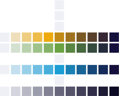
Step #6
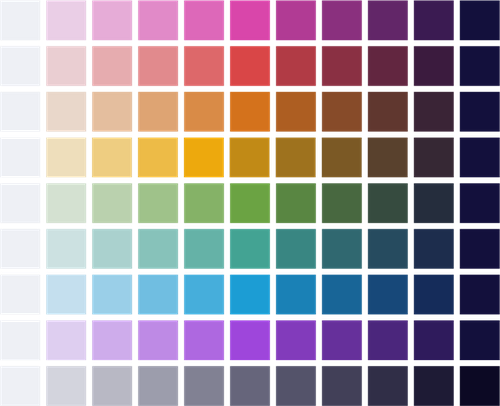
Fill in the placeholders to complete a rainbow in the middle column
Select one of the existing middle colors and use Illustrator’s color tool* to change the hue. Repeat this process until you have a middle column of 9 visually distinct colors that feels cohesive.

Tip: Your results will vary depending on which existing color you use as a starting point. Play around here until it feels right.
Step #7
Repeat Step 3 to build out all of the scales
Step #8
Check for even contrast
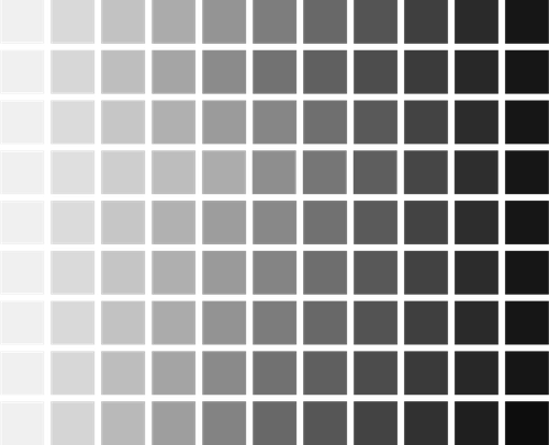
Once things are feeling good, desaturate your palette (Edit > Edit Colors > Convert to Grayscale) to check the contrast. Each scale should be reasonably similar. If something sticks out, make adjustments by tweaking the middle color or adjusting the steps for that row.
Step #9
Check for accessibility
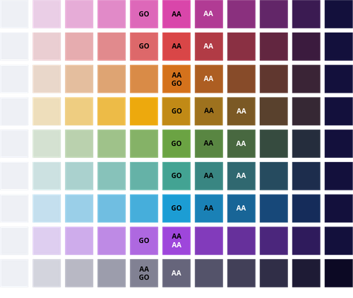
Now that you have your full palette, you’ll want to make sure you’re applying it in a way that is readable to all audiences. Use a contrast checker tool and take note of the following:
- G.O.: The color is dark enough to be used as a graphical object
- AA: The color is dark enough for white text to appear on top of it
- AA: The color is light enough for black text to appear on top of it
Step #10
Apply your colors based on the data type
Categorical Data
When each piece of data is unique with no correlation, use all unique colors. For accessibility, use the column where all colors pass the graphical object test as lines, solid shapes, or borders.

Gray can be used to emphasize a specific finding.

Tip: Order your colors to emphasize visual differences. For example, avoid placing blue next to teal.

Sequential Data
When there is a relationship between data with no meaningful middle point, use a single scale to color your data with a monochromatic effect.
Tip: You can use color to convey meaning, such as using red for a negative trend.
Diverging Data
When there is a meaningful middle point and two extremes, use two scales that meet in the middle.
Tip: You can use color to convey meaning, such as political party.
The Looper watches as you lower the paper, realization dawning in your eyes. You return to your desk and begin the transformation.
With your newly expanded palette, your colors no longer obscure the data—they illuminate it. Boss Man nods in approval. Jim from marketing wipes away a single tear of admiration. Your brand identity remains intact, stronger than before… and your data? Crystal clear. You save the file with reverence:
brand-guide-new-actual-final-no-really-v6.pdf
This time, you mean it.


